I don't need new dark theme, I need normal theme
How many times I seen the phrase: "If it doesn't have dark theme, I will not use it". Or vendors are adding dark theme as a feature bragging about it in the release notes. It seems today everybody wants to go with the flow and use dark theme, while what we need again is normal theme.
If we look into light and dark themes they have something in common - are deep dark or very bright, almost white - take Windows 10 light/dark modes for example. Light one is burning my eyes, dark one makes it hard to read in some lighting conditions.
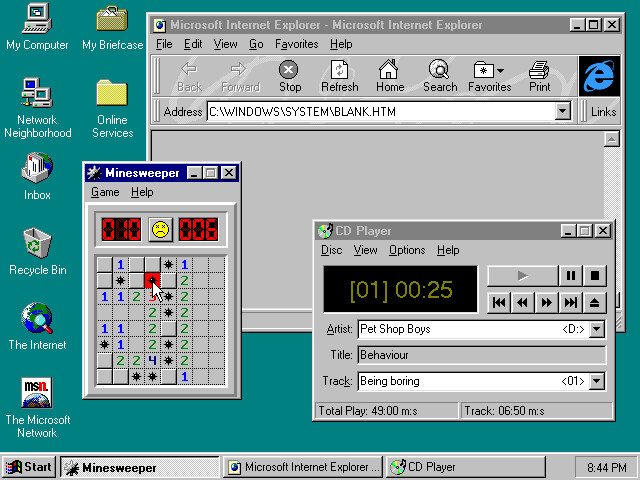
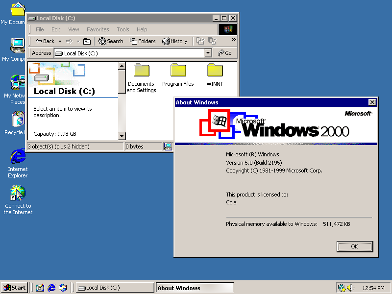
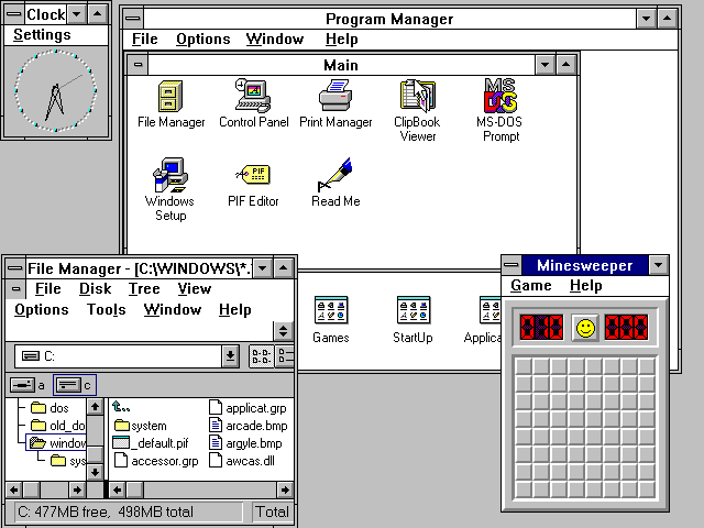
What I need is something in between. Something that as normal theme we had many years ago. Look at those two screenshots from Windows 98 and Windows 2000 above. When the UI loaded I was not blinded by the whiteness of windows, or had to strain my eyes to see something on a background.
Themes, in my opinion, should use more neutral colors. Neutral colors are ones without much of saturation. Examples includes gray, cream, beige, olive; white and black are also neutral colors, but those should not be overused in normal themes.
Some of the examples of well done themes, apart of Windows 95/2k already mentioned, are:
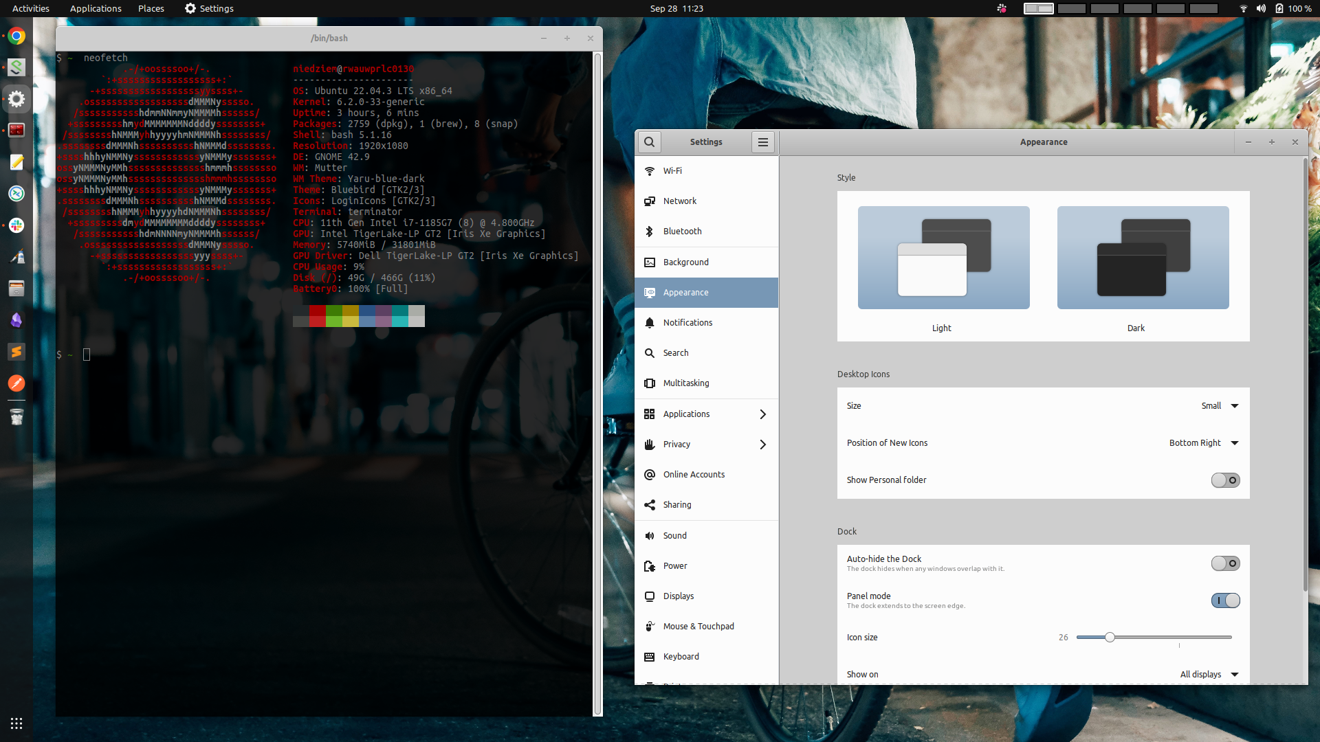
Ubuntu 22.04 I am using does not have any default theme I like. However, after some searching, I found the Bluebird GTK theme suits my needs. Will see.
There is an RSS feed for this blog.